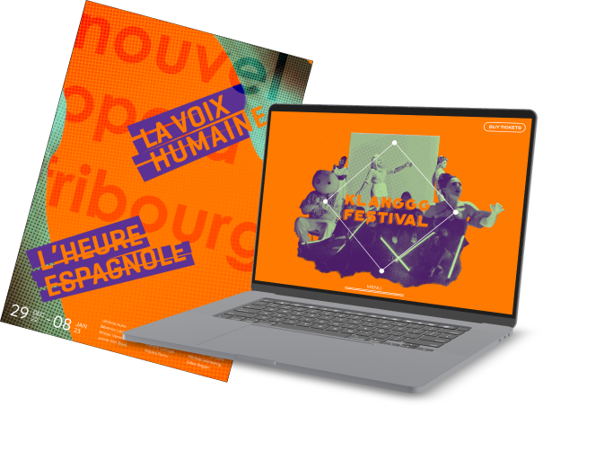
the klanggg
festival

nouvel opera fribourg

This project was a part of a second year design course which challenged our ability to work through the design process. The goal was to develop a microsite to promote an upcoming event for our client, the NOF. The NOF are an opera house in switzerland who put on events every year, some original and some being new versions of old stories.

Klanggg Festival Visual

Project Overview

Over the course of 5 weeks, our team was tasked with developing an art direction for our client Nouvel Opera Fribourg (NOF), followed up with a microsite to promote their upcoming event the klanggg festival. This project involved researching the work of a contemporary designer, designing posters to develop an art direction and finally iterating over and over until we landed on a final microsite.

My Role

Content Design
Prototyping
Visual Design

Tools Used

Figma
Adobe After Effects
Adobe Photoshop

Team

Baseer Joya
Jaques Widodo
Kaleigh Tran
Yixuan Liu

Researching Precedence

The first step was to research precedents and develop a series of design principles that would help carry our art direction. This involved researching a contemporary designer (Dan Friedman) and picking out design principles that he applied in his own work. The research was meticulous and it was ensured that a large collection of Friedman's works was gathered to identify key principles. The images below are examples of Friedman's posters that were studied.

Poster of Dan Friedman's highlighting the letter F with two spheres on it
Dan Friedman's operations on a gird poster that highlights the combination of grids and reverse bars
Friedman's New Haven Poster. Three legs of a woman that lead the eye to the center

Friedman's Principles

After researching our precedent designer, I was able to identify 2 out of 3 principles listed below. The two being opposing tension in images and reverse bars to highlight visual hierarchy.

Intense Type Scale to Define Clusters

Opposing Tension in Images to Create Balance

Reverse Bars to Highlight Visual Hierarchy

Forging the Art Direction

With our principles defined and our precedence research completed, we moved on to defining an art direction for our microsite. To do this, we were tasked with designing various posters of NOF shows. The posters were meant to visually attract audiences and promote the event while also define an art direction for the team to stick to as we move to the next phase of the project. Below are examples of our art exploration. These 3 were posters our instructors felt were suitable art directions. The second poster was one that I developed. The first poster is the art direction we ultimately decided to pursue.

NOF poster
Far West poster
NOF poster promoting the brunch event

Our Art Direction

After gathering feedback and deliberating as a team, we decided to move forward our art direction. At this stage, it was important to assess the impact of the art direction in different forms by creating mockups of our poster on different items.

Picture of a promotional truck highlighting our art direction
Picture of a ticket promoting the klang festival
Picture of a road sign promoting the klang festival

Our Microsite

The Landing Page

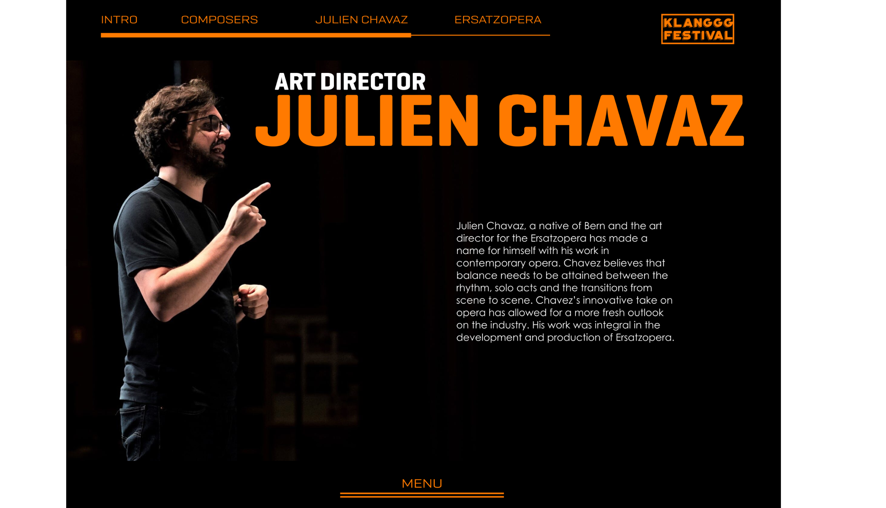
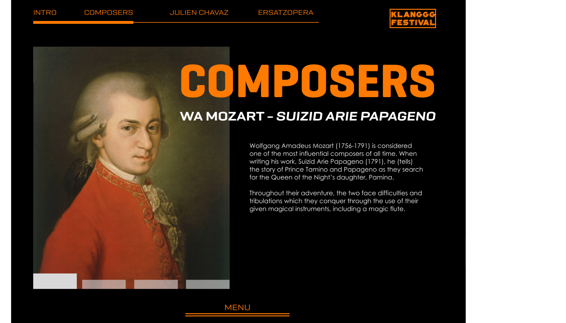
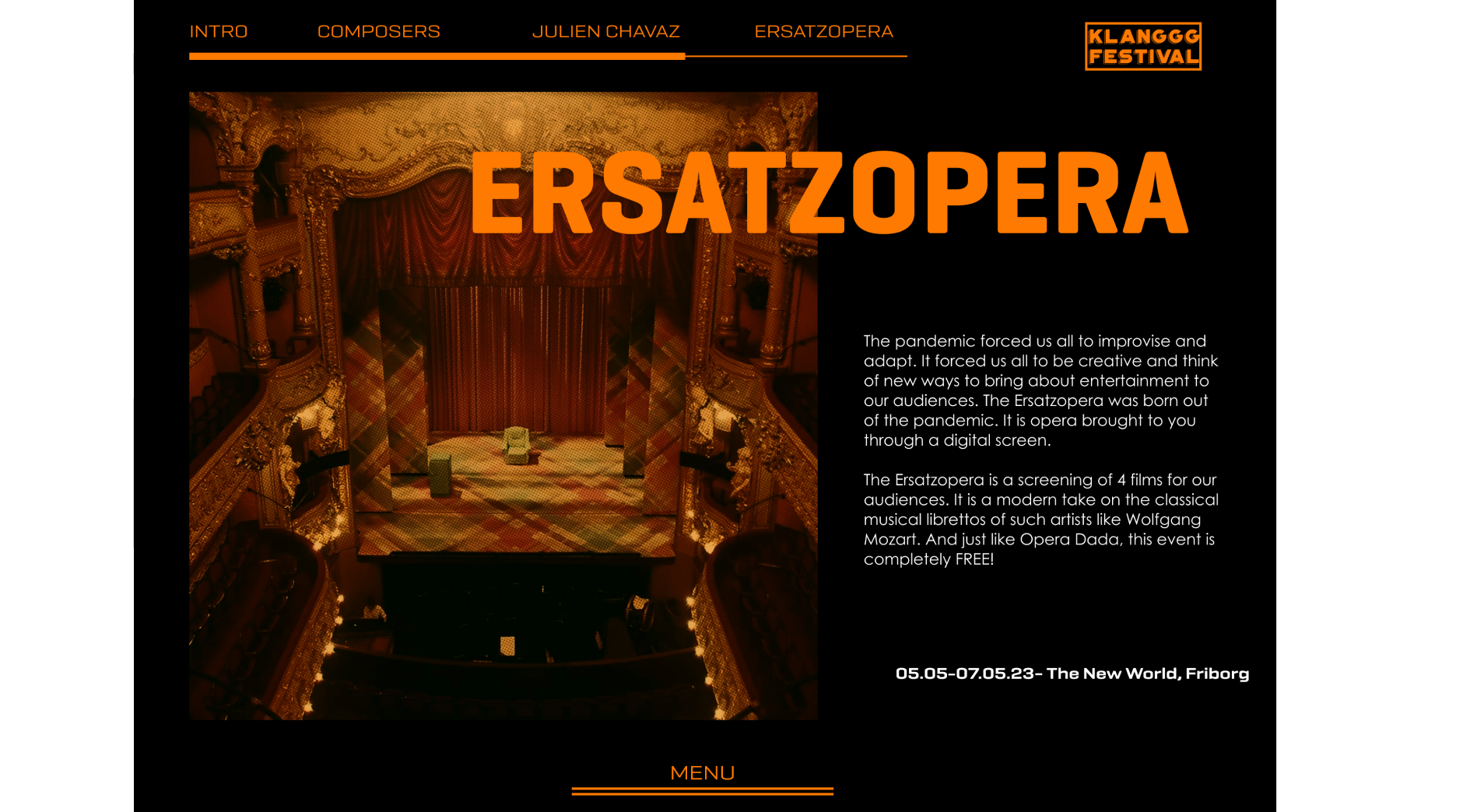
The website’s goal was to target a pre-show experience. Where users can explore and learn about NOF’s opera’s stories, composers, and more behind the scenes. By emphasizing the pre-show experience, the hope was that customers would be more inclined to purchase tickets and attend events at the Klanggg Festival.

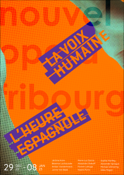
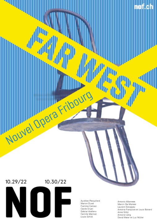
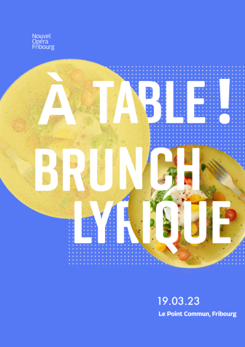
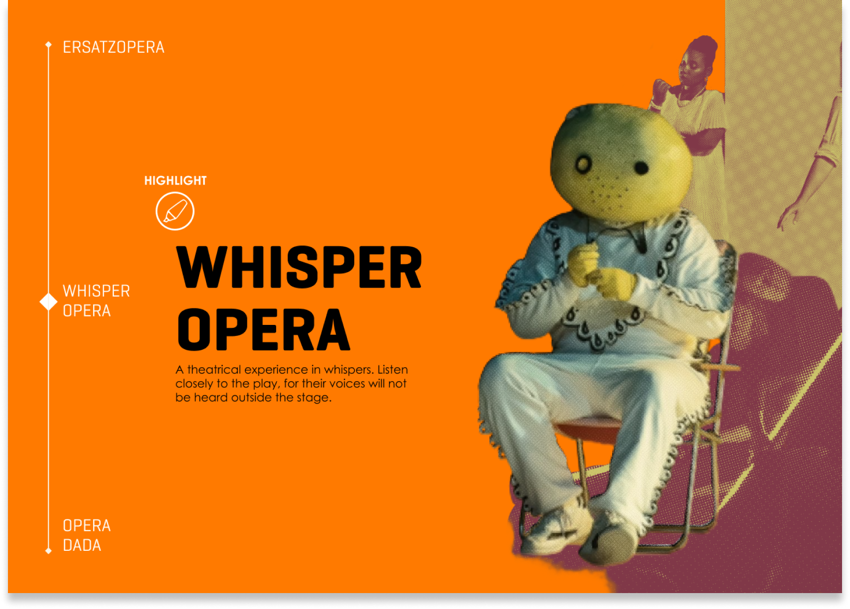
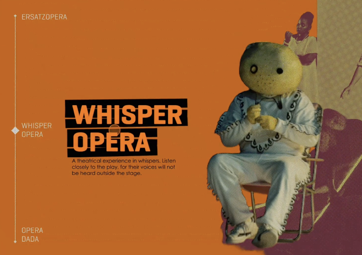
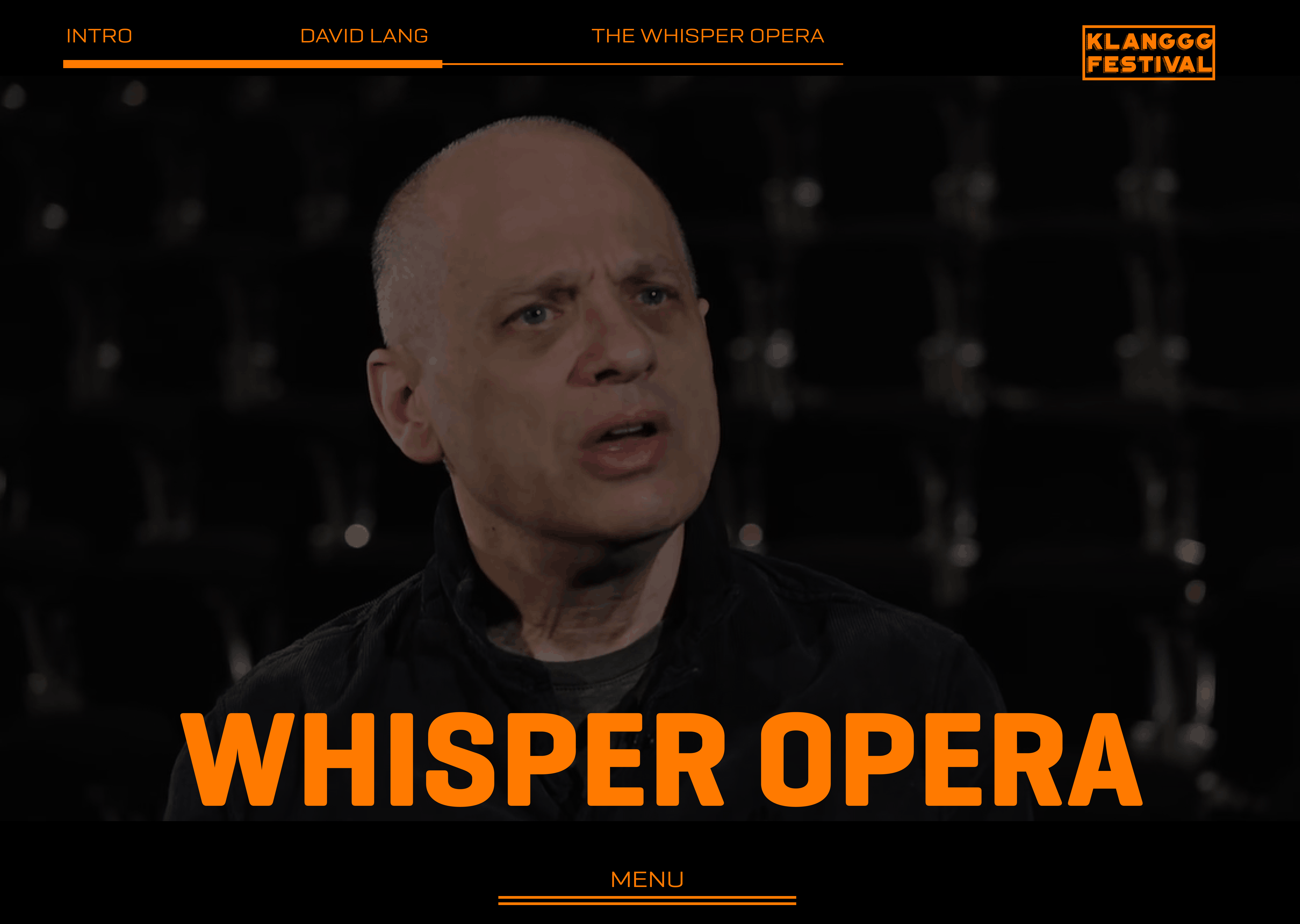
As the content designer, I proposed an engaging and interactive centerpiece for the landing page, drawing inspiration from successful precedent works. The centerpiece features four visually dynamic images, each representing a key event during the festival. Hovering over an image triggers a zoom-in effect, revealing more information about the event and enticing the user to explore further. Clicking on an image initiates a seamless animation transition, guiding users to the event's dedicated page where they can access a detailed description. This design not only enhances user engagement but also provides a visually cohesive and immersive experience, aligning with the festival's vibrant theme.

The choice in animations and interactions were chosen to sell the expereince of the NOF and the Klanggg Festival as a whole. With the art direction meant to be fun and energizing, interactions were pursued in a similar manner.

Klanggg Festival landing screen

Creating a seamless transition while allowing the user to dive deeper into the content. Clicking enables an interactive action that animates the following transition into a video subjected to the opera selected. The user will then scroll to learn more details.

image of NOF homescreen highlighting whisper opera Image of NOF homescreen after clicking whisper opera Homescreen of Whisper opear page

Curated Content

In my role as the content designer, I developed the secondary pages for the Klanggg Festival website to effectively highlight each event and promote audience engagement. The visual aesthetics were altered to provide a more professional feel for this section but core elements were retained as to not lose the connection to the landing page. I focused on creating detailed and immersive content tailored to the niche opera audience. These pages emphasize depth and authenticity by providing insights into the stories, composers, historical context, and unique features of each opera. By aligning with the audience's appreciation for rich, engaging content, these secondary pages enhance the pre-show experience and strengthen the connection between the audience and the Klanggg Festival events.

page describing Julien Chavez page describing ersatzopera composers page describing the ersatzopera page with the dada video Page describing the DADA movement page describing Opera Dada page describing whisper opera David Lang Bio

Challenges and Lessons Learned

Over the course of five weeks, our team faced significant stress to keep up with our classmates. Collaborating in a team of four taught me the value of clear role assignments. As the lead content designer and researcher and secondary visual designer, I could focus on my tasks while trusting my teammates to deliver. I also learned how to use micro-interactions effectively to enhance a website’s experience.

The project emphasized drawing inspiration from other designers and thinking laterally in the design process. It taught me to let go of ideas that no longer fit and to balance multiple iterations—a challenging but rewarding experience.

There were moments when our deliverables fell short and faced criticism, which was hard to hear. However, this taught me to trust our process and my teammates, resulting in a polished final product that met expectations.